



46%
Growth in Account Expansion
67%
Improvement in Customer Sentiment Scores
81%
Enhancement in User Experience Efficiency
72%
Increase in Survey Response Rates
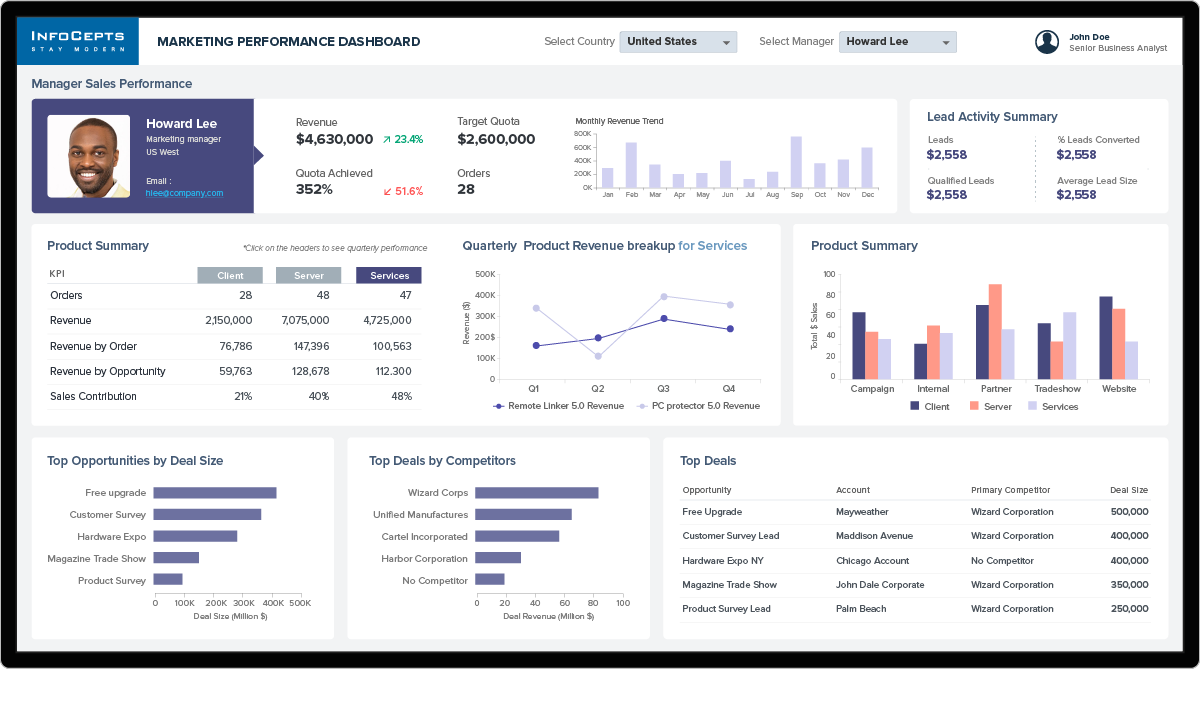
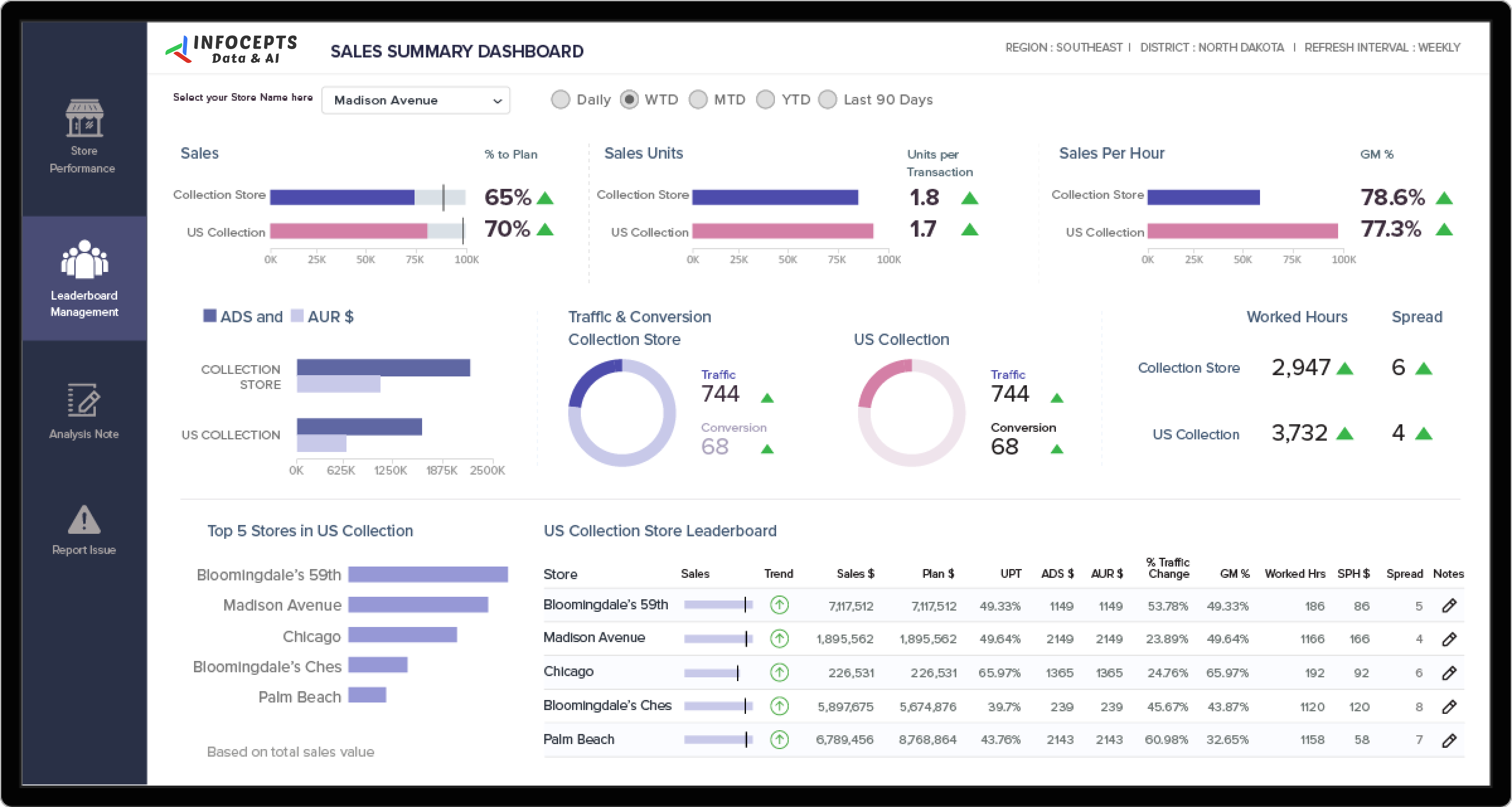
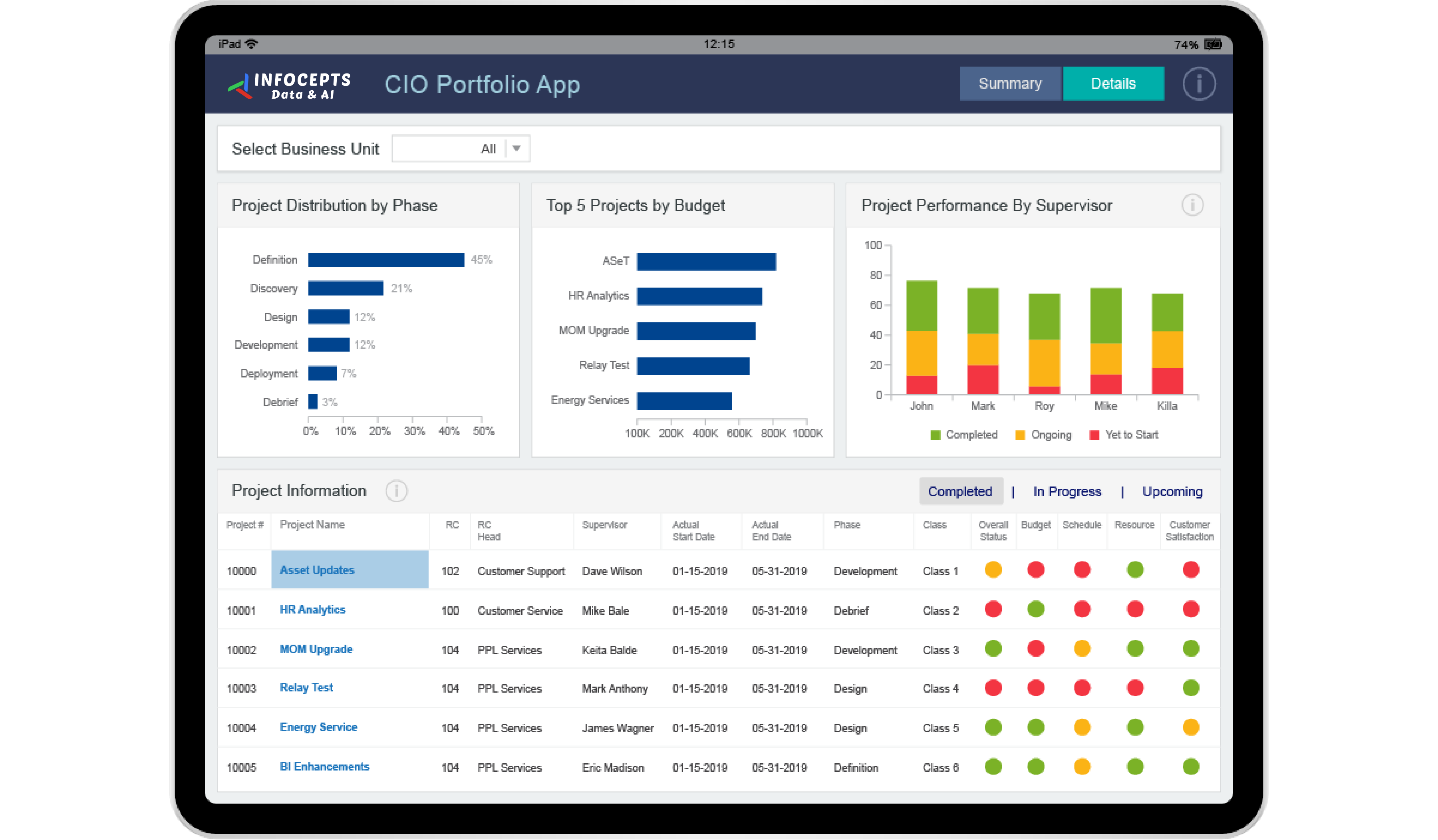
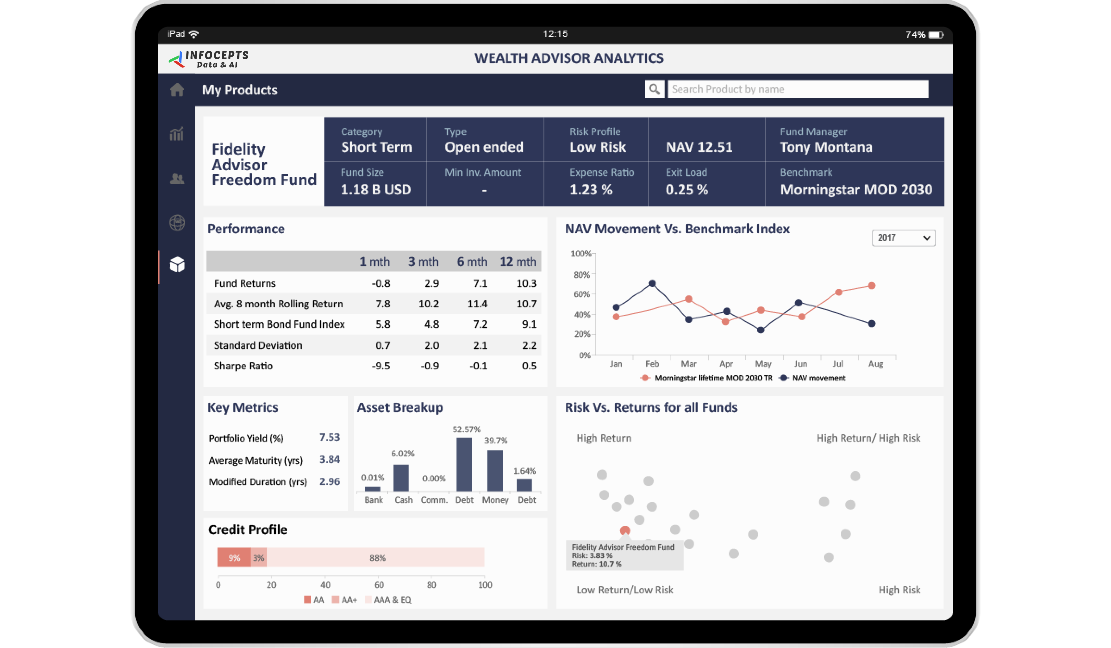
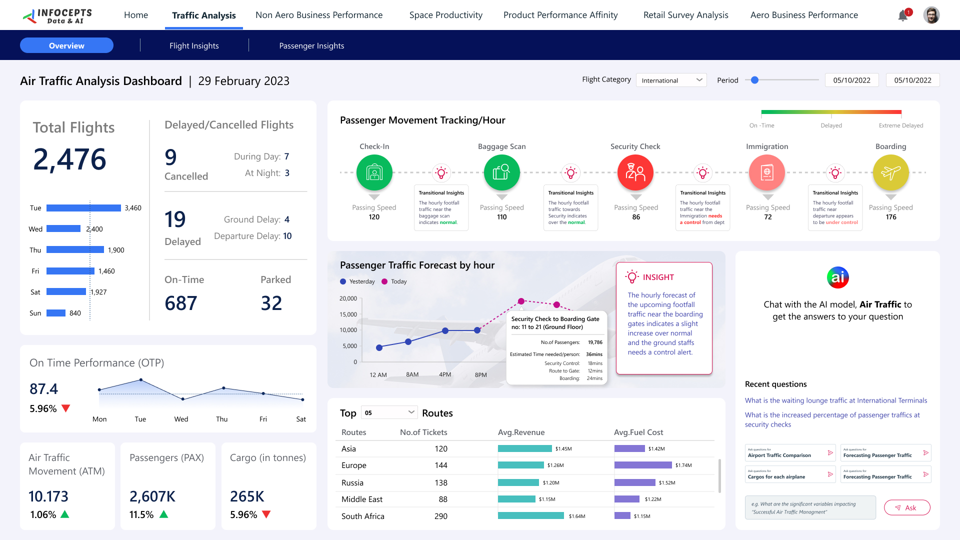
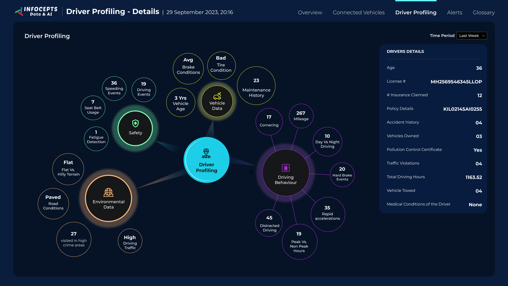
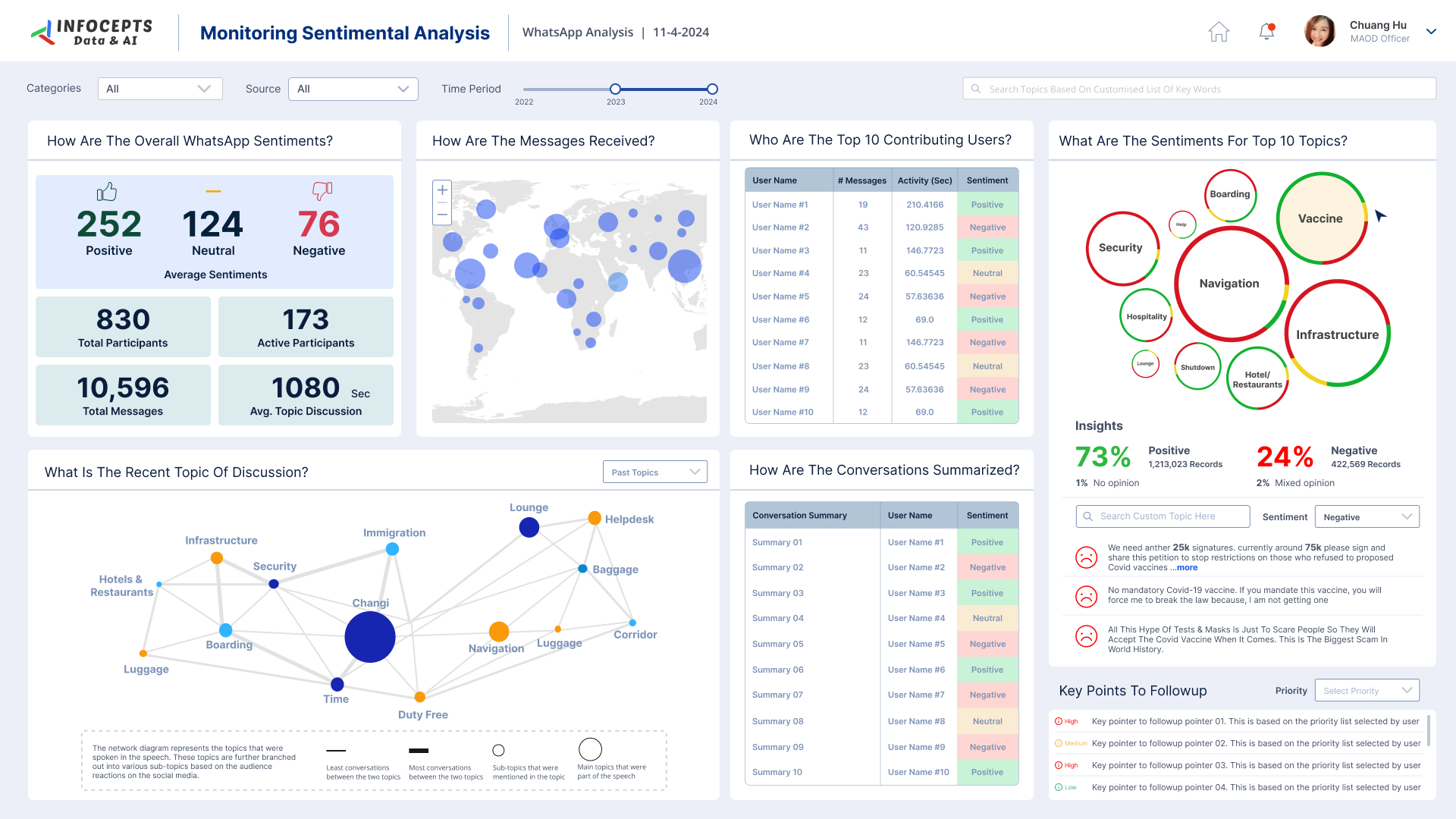
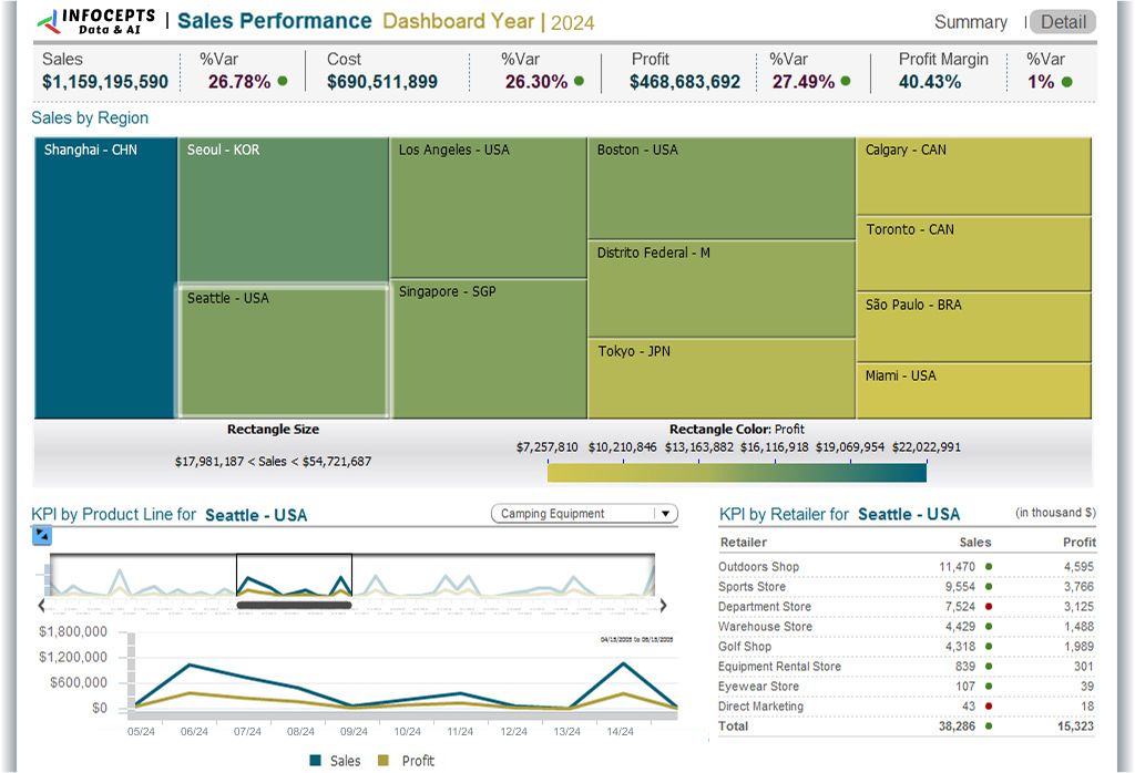
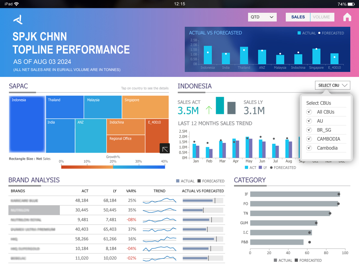
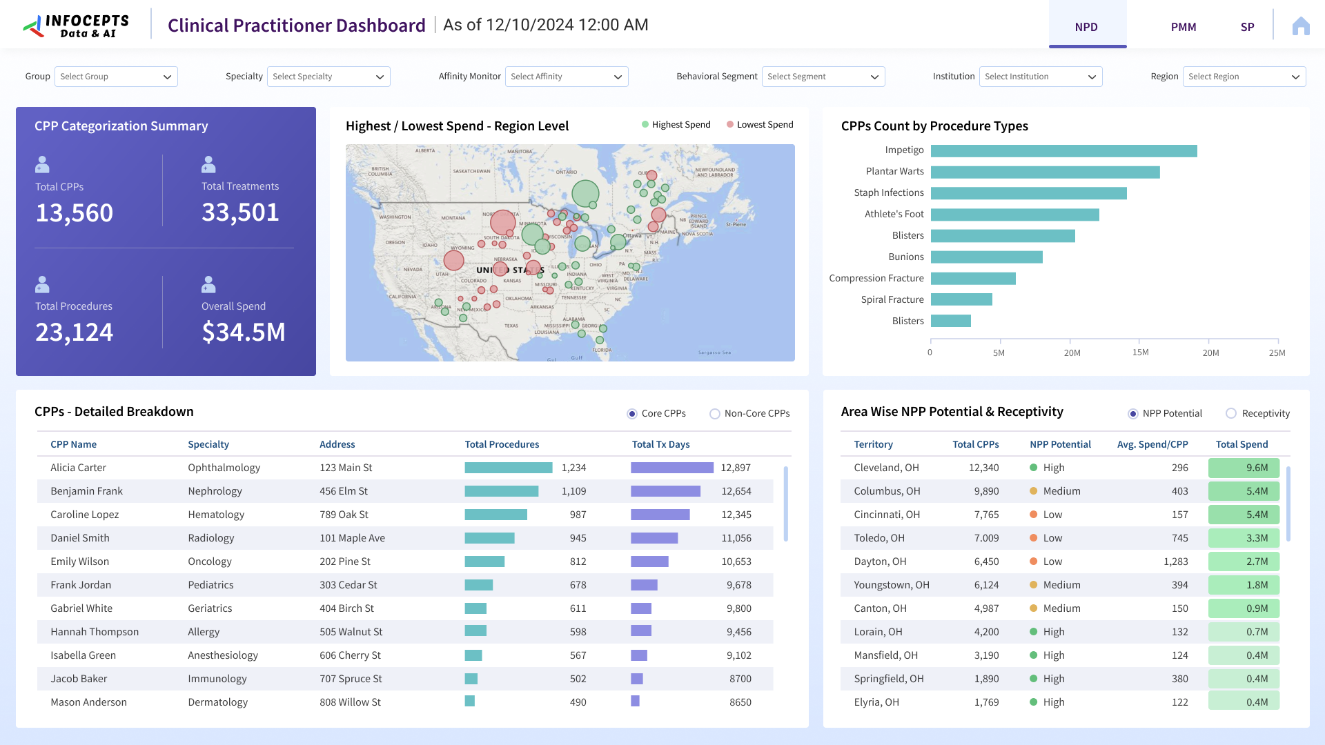
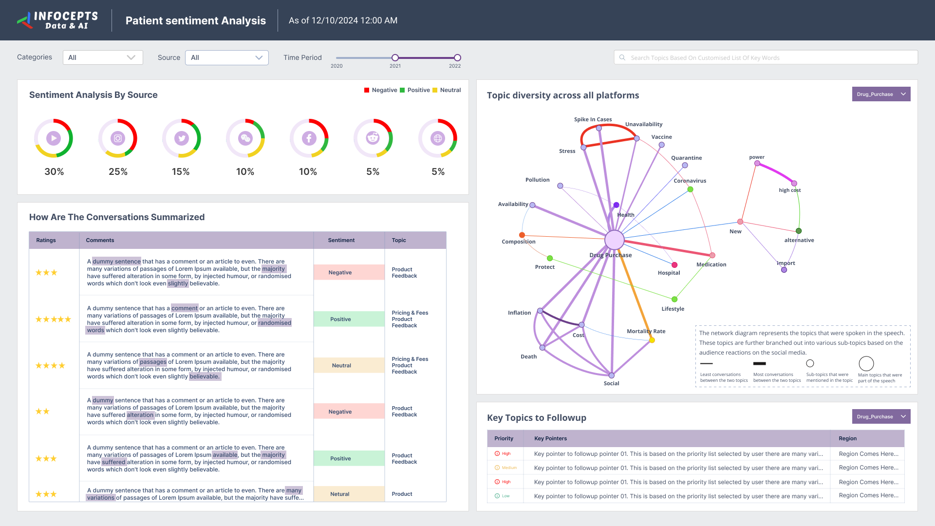
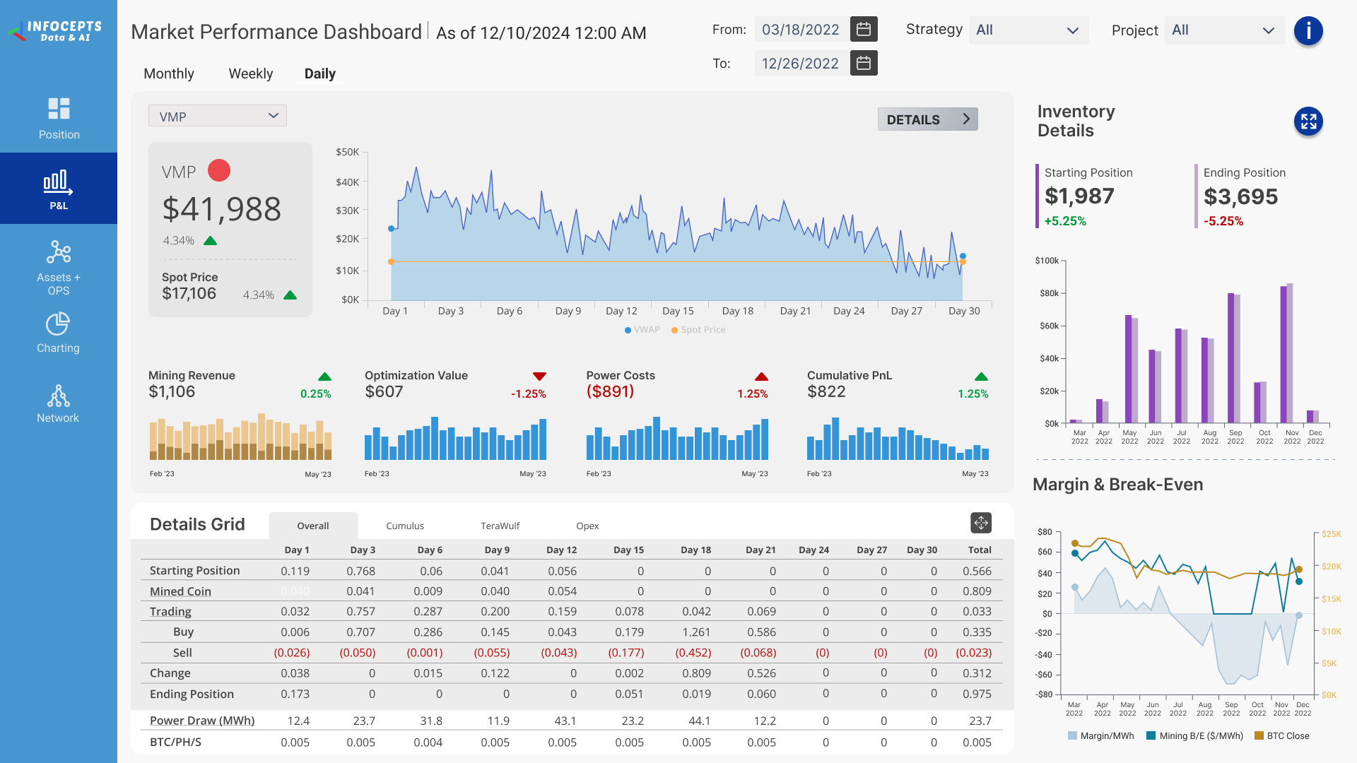
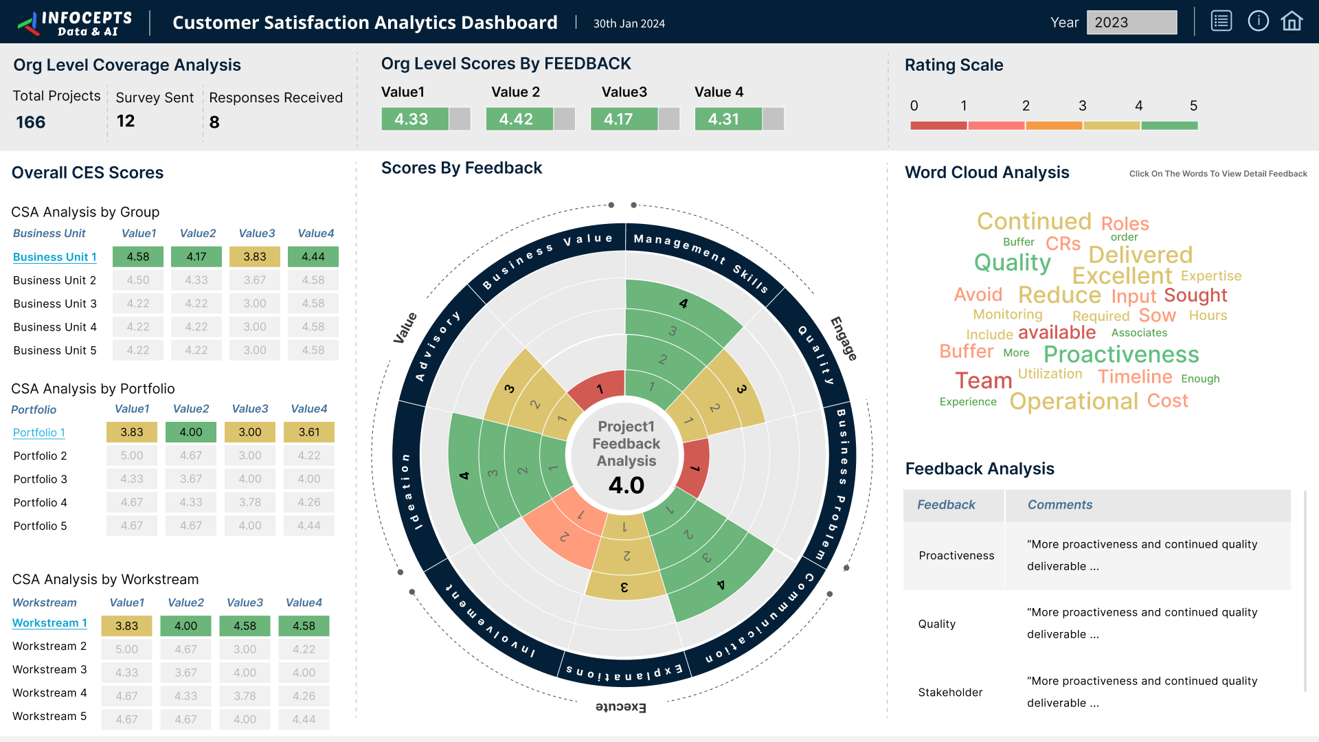
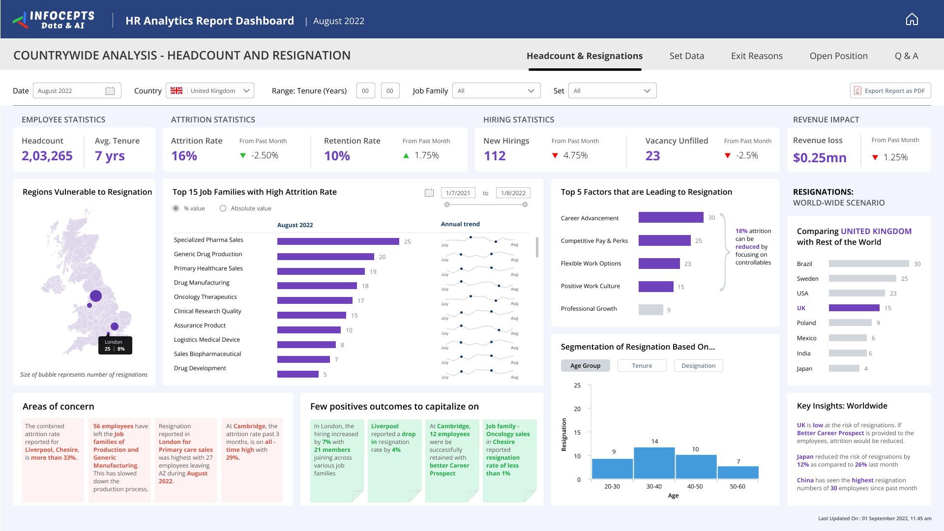
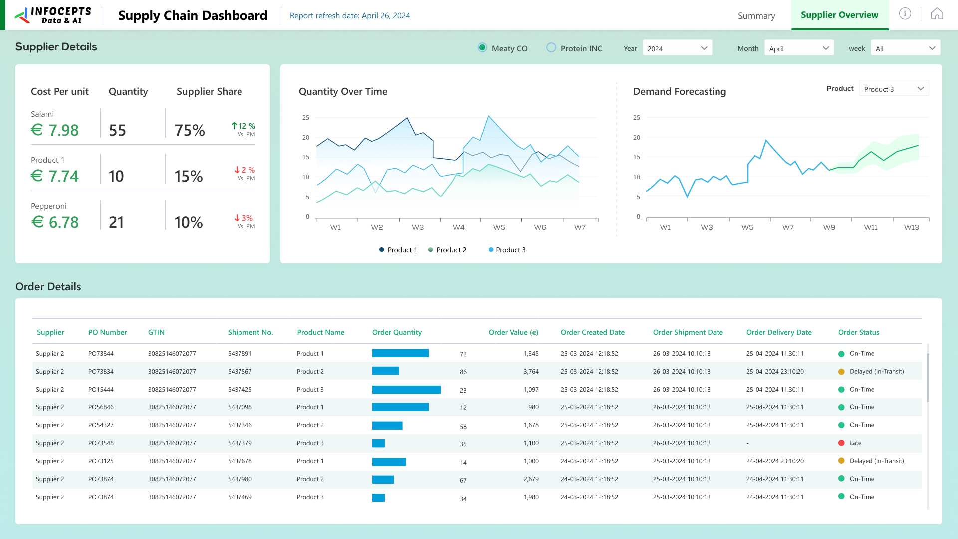
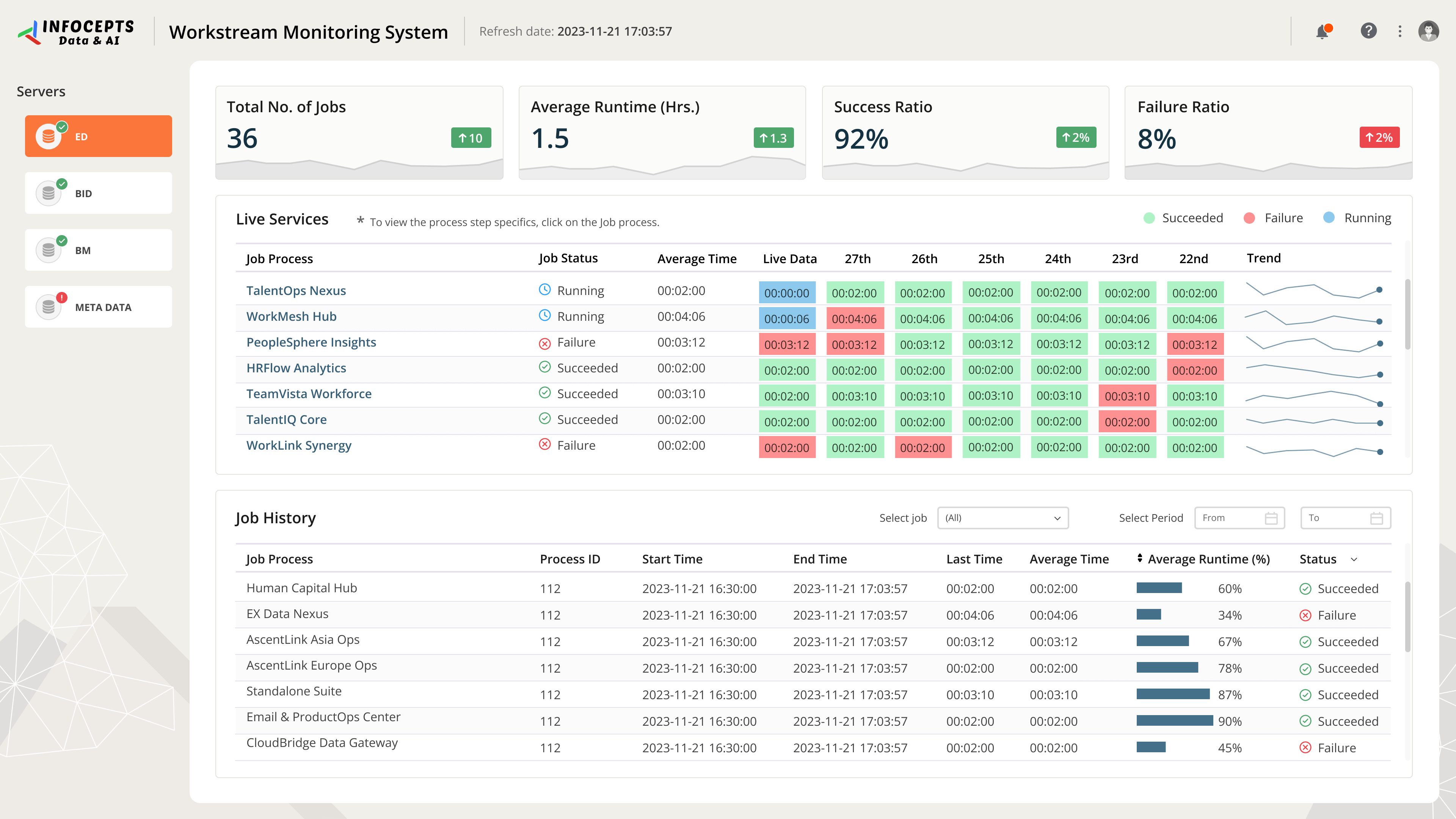
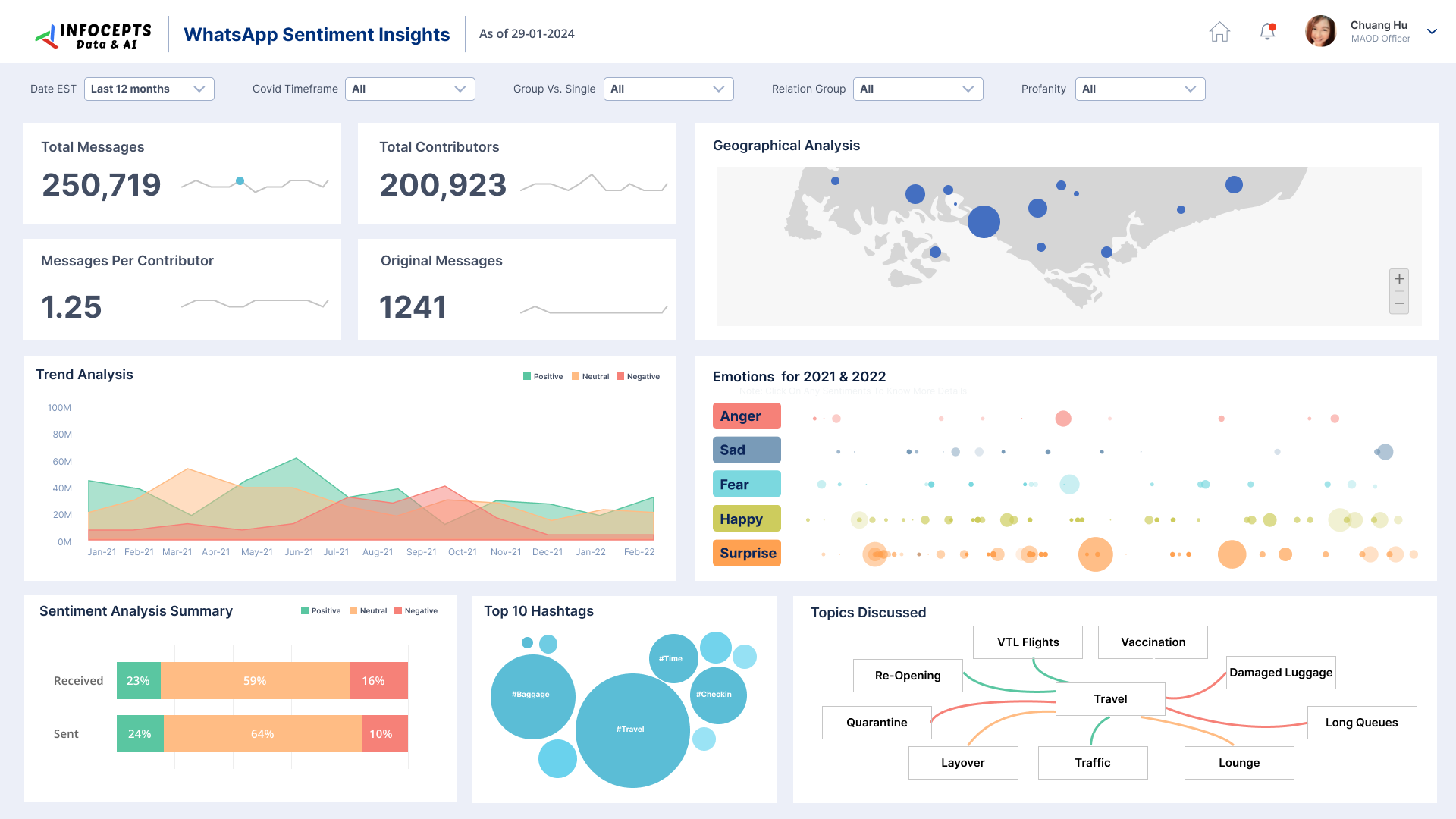
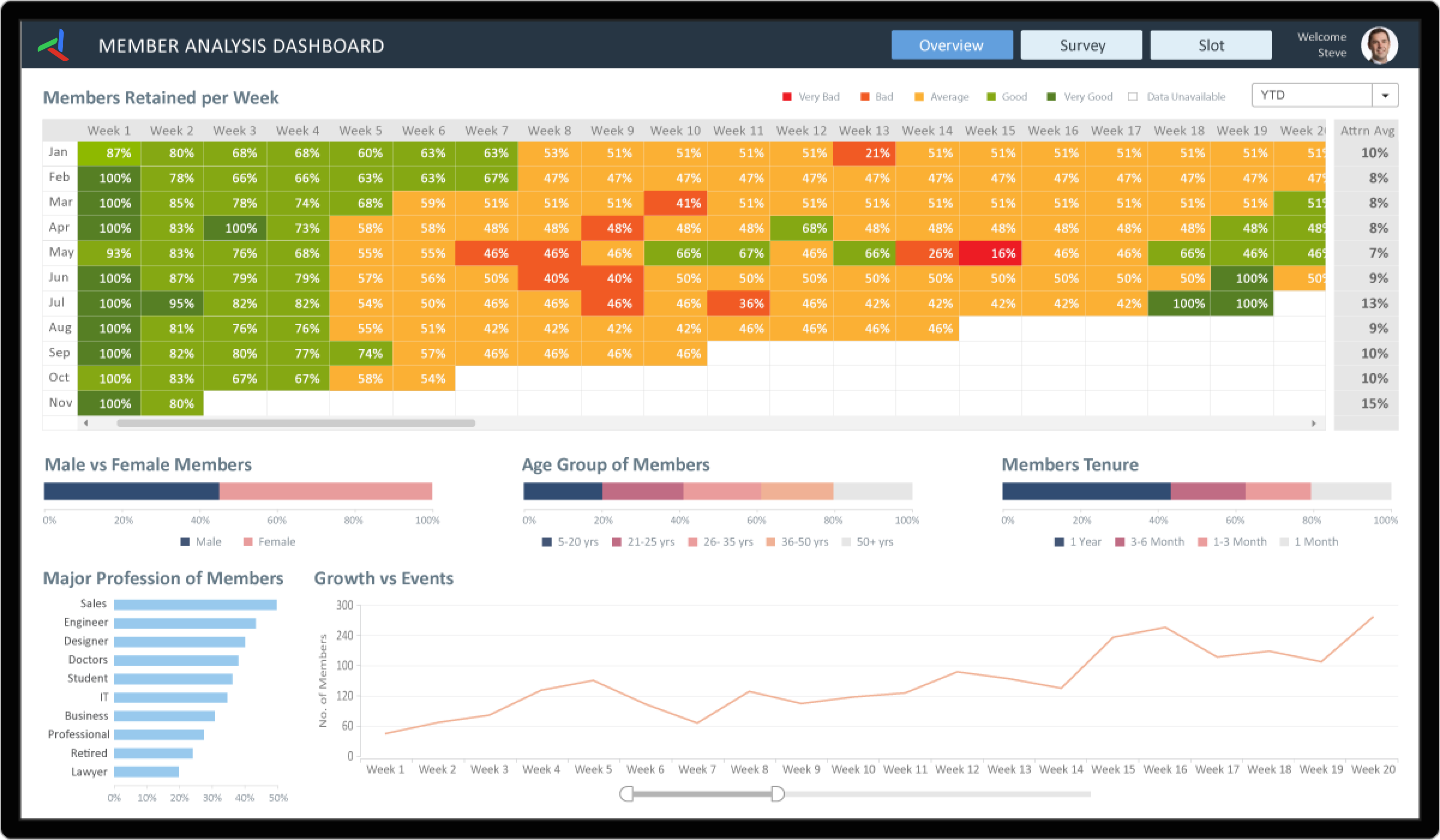
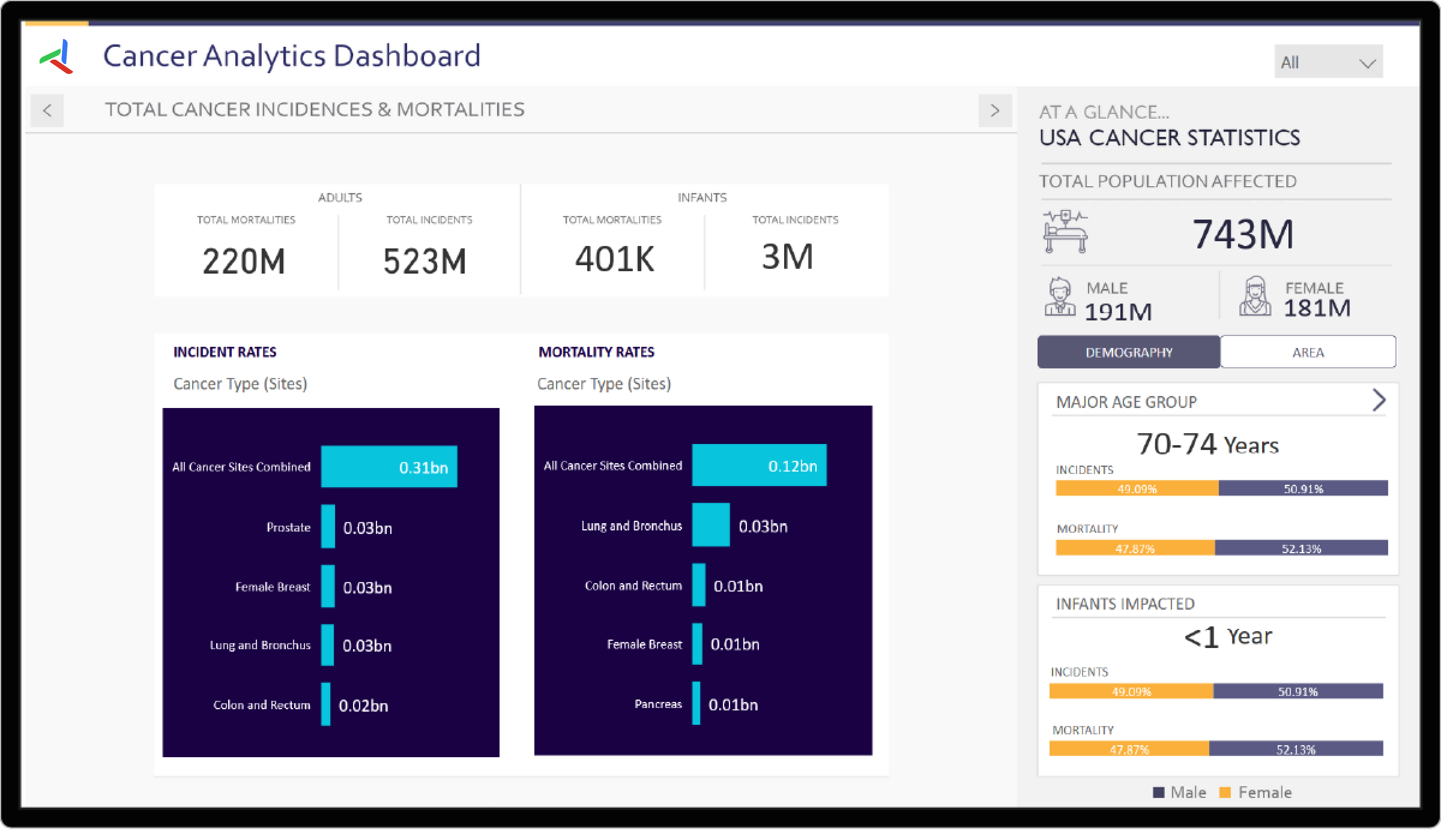
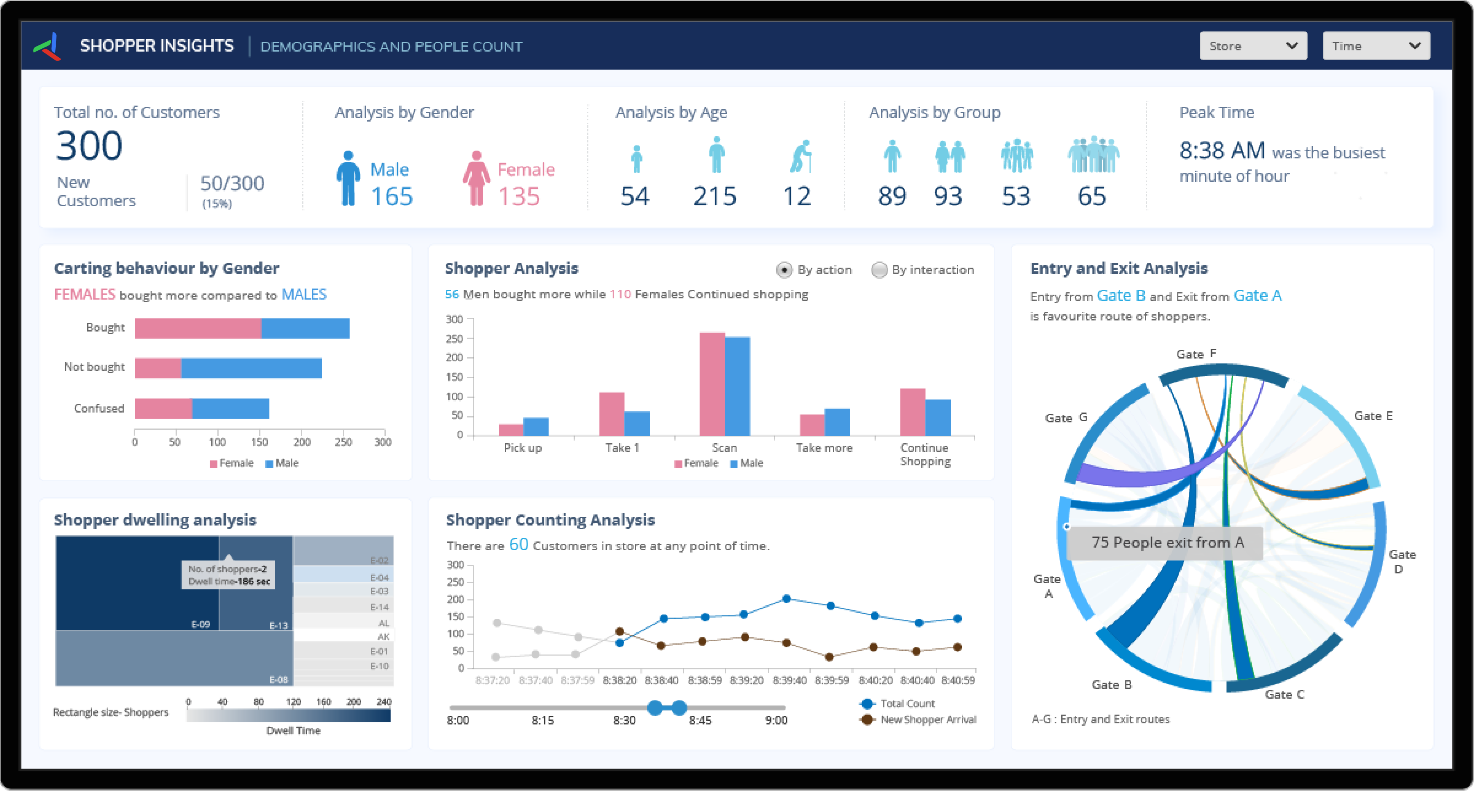
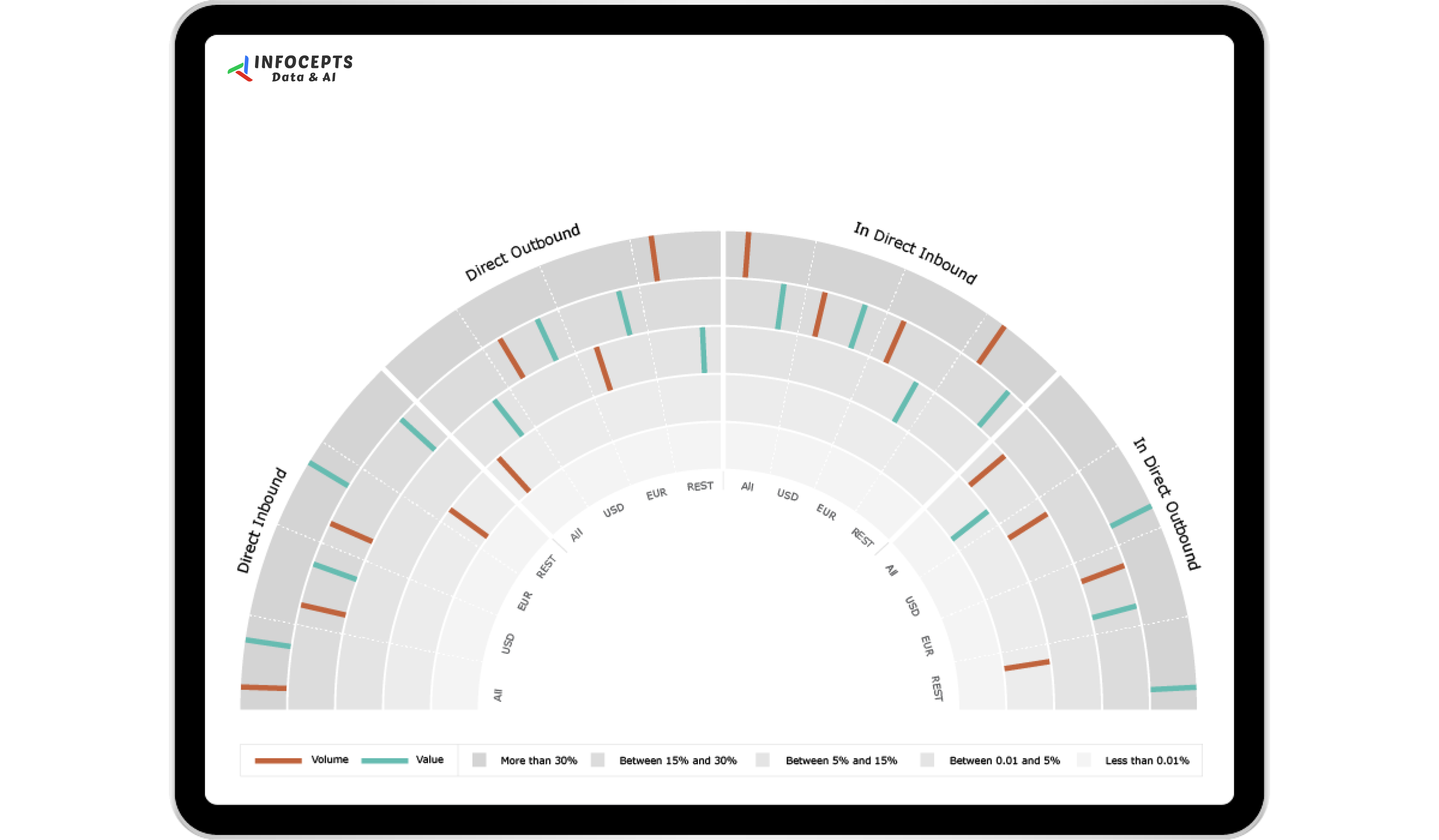
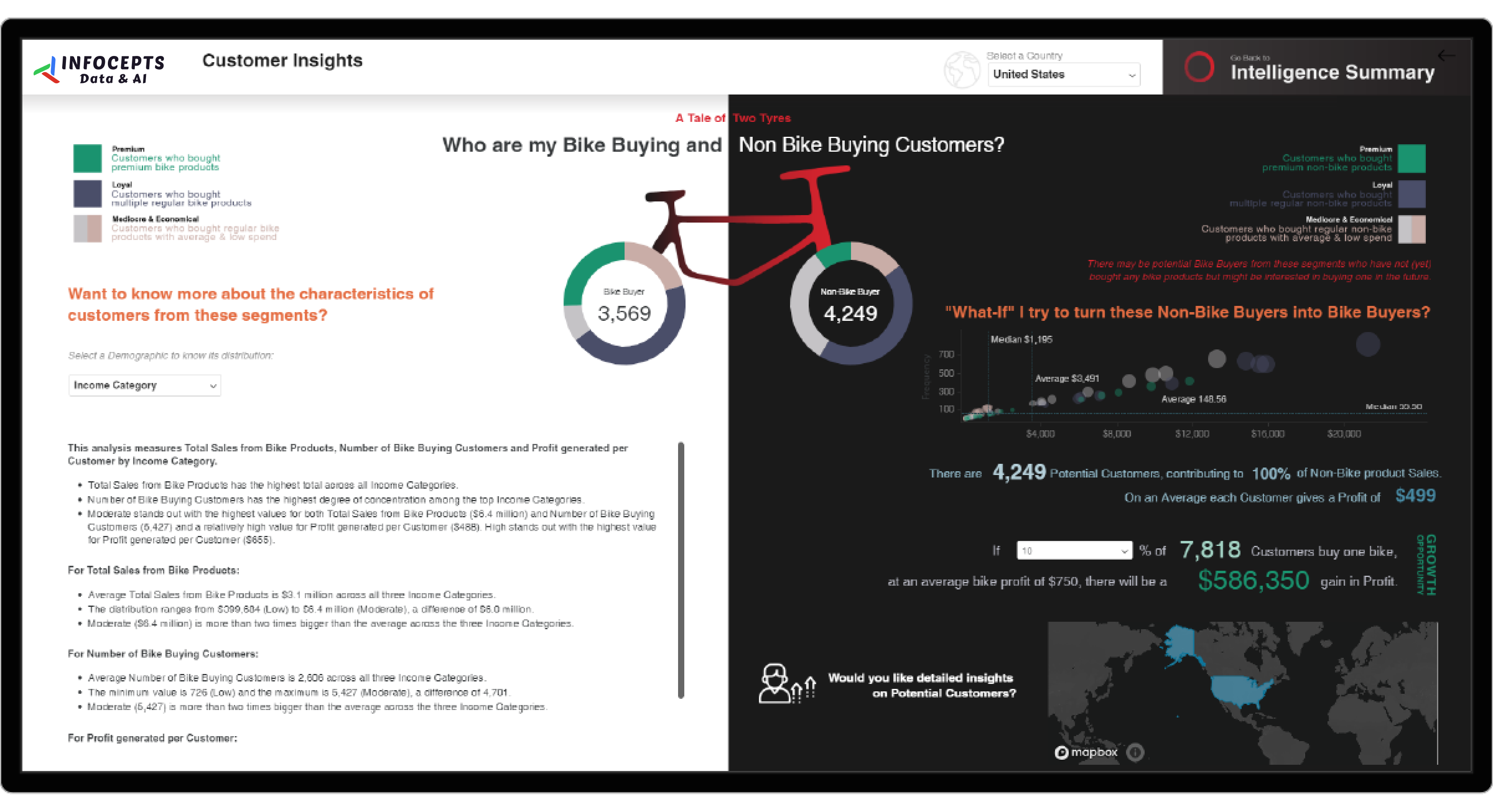
Provides a comprehensive analysis of customer sentiment across markets, accounts, and projects. Visual elements such as word clouds highlight recurring themes, while sunburst charts break down engagement, execution, and value scores to pinpoint service gaps. By transforming survey data into actionable insights, this dashboard helps businesses prioritize improvements, optimize resource allocation, and strengthen customer relationships, leading to increased satisfaction and retention.
Frequently asked questions
It turns raw survey responses into sentiment, engagement, and value scores across markets, accounts, and projects, replacing a spreadsheet of open-ended comments with a structured, comparable view.
Word clouds surface the themes customers mention most often, while sunburst charts break engagement, execution, and value scores down by account or project so patterns are visible at a glance.
Comparing scores across accounts or markets shows exactly where execution or value perception is lagging, rather than relying on a single averaged satisfaction number.
Customer experience, account management, and delivery teams responsible for acting on survey feedback rather than just collecting it.
No. It sits on top of existing survey data as an analysis and visualization layer, turning responses already being collected into something teams can act on.
By applying natural language processing to open-ended responses through Artificial Intelligence work, then visualizing the results through Business Analytics services.

 Pranali Lanjewar